Top 10 Key Credit Risk Metrics for Fintechs in 2026
Master the credit risk metrics that actually protect your portfolio. Learn how top fintechs track, interpret, and act on risk signals in 2026.


After years of building credit risk infrastructure and talking to lending teams across different markets, I've noticed a pattern.
The portfolios that hold up under pressure aren't always based on the most sophisticated models. They belong to teams that consistently track the right credit metrics and act on what those numbers tell them.
If you're running credit risk at a neobank, a BNPL platform, or a microfinance company, you're already navigating a lot. Regulatory pressure. Thin-file borrowers. Fast-moving portfolios.
The last thing you need is a metric framework that adds noise instead of clarity. So I've kept this list focused.
1. Probability of default (PD)
PD is the estimated likelihood that a borrower will fail to repay within a defined time horizon, typically 12 months.
It sits at the core of almost every downstream risk calculation. Get PD right, and the rest of your framework has a solid foundation. Get it wrong, and everything built on top of it drifts.
Most teams model PD using logistic regression or machine learning approaches, trained on historical repayment data.
The challenge for fintechs operating in underserved markets is that many borrowers don't have the credit history needed to build a reliable PD model from bureau data alone.
This is where alternative data earns its place. Digital footprint signals, behavioral patterns, and transactional data can fill the gaps that traditional bureau data leaves open.
At RiskSeal, we see this regularly: a borrower with no credit history can still generate meaningful risk signals through their digital behavior.
One thing worth flagging: PD is not a one-time score. A borrower's risk profile changes.
Treating PD as static – calculated at origination and never revisited – is one of the more common and costly mistakes in portfolio management.
2. Loss given default (LGD)
LGD measures what you actually lose after a default, once recoveries are factored in.
The formula is straightforward: LGD = (1 – Recovery Rate) × EAD. But the inputs are anything but simple.
In secured lending, LGD is anchored to collateral values. In unsecured digital lending, which describes most fintech portfolios, there's no collateral backstop.
Recovery depends almost entirely on your fintech collections infrastructure, your legal environment, and how quickly you can act after a default event.

In many emerging markets, LGD is structurally higher than teams expect. Legal recovery frameworks are slow. Collections costs eat into whatever is recovered.
This needs to be explicitly built into your provisioning assumptions, not estimated away with an industry average.
A practical habit: segment LGD by product type, geography, and vintage rather than applying a single portfolio-wide figure. The variation is usually larger than people expect.
3. Exposure at default (EAD)
EAD is the total outstanding amount, including any undrawn credit lines, at the moment of default.
For fixed-term loans, EAD is relatively predictable. For revolving products like credit lines, BNPL facilities, and digital credit cards, it's more complex.
Borrowers under financial stress often draw down available credit before defaulting. That means your actual exposure at the time of default can be significantly higher than the current balance.
Static EAD estimates based on origination snapshots don't capture this. Teams running revolving products need dynamic EAD tracking that updates with utilization behavior over time.
It's also worth noting that EAD, LGD, and PD don't operate independently. A borrower approaching distress typically sees all three move at the same time:
- higher utilization (EAD up)
- lower recovery prospects (LGD up)
- elevated default probability (PD up)
That correlation is easy to miss when you're looking at each metric in isolation.
4. Expected loss (EL)
Expected loss ties the previous three metrics together into a single operational number. The formula goes as follows: EL = PD × LGD × EAD.
For a loan with a 3% PD, $10,000 EAD, and 50% LGD: EL = $150. That $150 is what your provisioning and pricing need to account for, on average, across that exposure.
EL is the metric that connects credit risk directly to financial planning. It's how you set reserve levels, calibrate pricing, and understand whether the returns on a product segment are actually covering the risk you're taking.
It also maps directly to provisioning requirements under IFRS 9 and equivalent local standards, which require expected credit loss calculations across portfolio stages.
One honest note: EL is only as accurate as its inputs. An overoptimistic PD combined with an underestimated LGD produces a figure that looks reassuring and isn't.
Reviewing the assumptions behind each component is time well spent. Especially after major portfolio changes.
5. Gini coefficient
The Gini coefficient measures how well your scoring model separates good borrowers from bad ones.
A Gini of 0 means the model is no better than random. A Gini of 1 means perfect separation. In practice, consumer credit models typically land between 0.40 and 0.70, depending on data richness and market maturity.
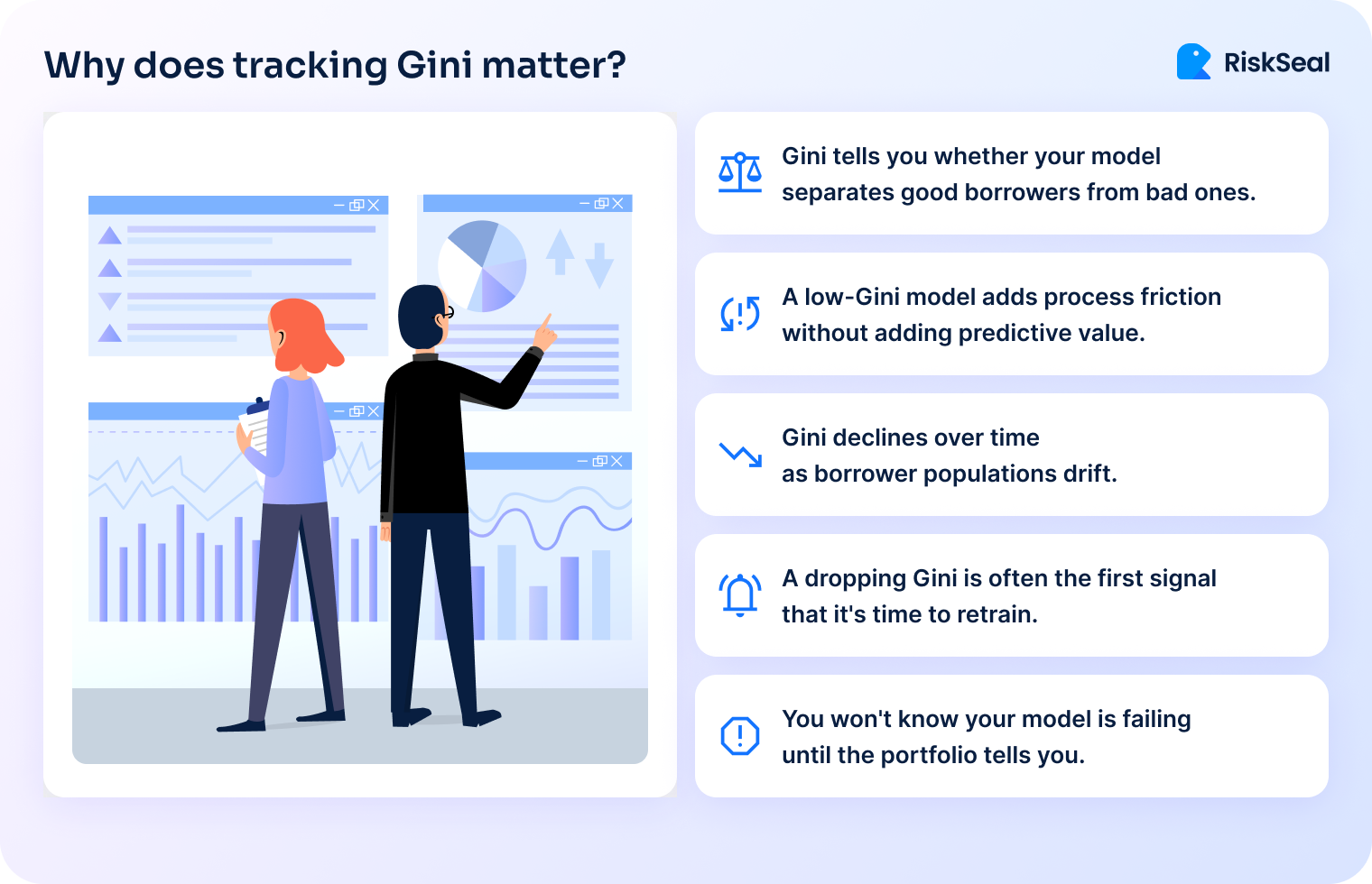
What Gini tells you is whether your model is actually doing its job. A scorecard that looks technically solid but has a Gini of 0.30 isn't protecting your portfolio. It's just adding process friction without adding predictive value.
More importantly: Gini needs to be monitored over time, not just at model launch. A declining Gini is often the first signal that your model is becoming stale.
In other words, this means that the population of borrowers has drifted away from the population the model was trained on. When Gini starts to fall, it's time to revisit your feature set and retrain.
For teams familiar with AUC-ROC: Gini = 2 × AUC – 1. The two metrics are equivalent, just different ways of expressing the same discriminatory power.
6. KS statistic
The KS (Kolmogorov-Smirnov) statistic measures the maximum separation between the cumulative score distributions of good and bad borrowers.
While Gini gives you a single global measure of model quality, KS tells you where your model works best and where it struggles.
A high KS at the low end of the score range means your model is good at flagging your worst risks. A high KS in the middle means it's most useful for differentiating borderline applicants.
This matters for cutoff strategy. If you're setting an approval threshold, knowing where in the score distribution your model has the most confidence helps you make a more precise decision.
As a rough guide: KS below 20 suggests weak discrimination, 20–40 is acceptable, and above 40 indicates strong model performance.
These benchmarks shift depending on the product and market, but they're a reasonable starting point for calibrating credit metrics for banks.
7. NPL ratio
The NPL (non-performing loan) ratio is the share of your portfolio classified as non-performing. It’s most commonly defined as loans 90+ days past due.
It's the metric that regulators, investors, and board members tend to watch most closely. And for good reason: it's a clear, comparable indicator of portfolio health.
The important caveat is that NPL ratio is a lagging indicator. By the time it moves, the credit events driving it happened months ago.
A rising NPL ratio tells you something went wrong in underwriting or collections, but not in time to prevent it.
One thing that trips up cross-market comparisons: NPL definitions aren't universal. Some markets use 60+ DPD, others 90+. Some products have different classification rules.
If you're benchmarking against industry figures or reporting to international investors, clarity on the definition matters as much as the number itself.
NPL ratio is most useful when paired with provisioning coverage – the ratio of reserves to NPLs.
A high NPL ratio with strong coverage is manageable. A high NPL ratio with thin coverage is a capital problem.
8. Cost of risk (CoR)
CoR is your annualized credit loss provision expressed as a percentage of the average loan portfolio.
If your portfolio averages $5M and you provision $250K in credit losses over the year, your CoR is 5%.
This metric connects credit risk directly to P&L. It's what tells you whether your pricing is actually covering the losses you're absorbing.
If you're lending at 20% APR but running a CoR of 15%, the margin left to cover funding costs, operations, and profit is extremely thin.
CoR benchmarks vary significantly by product and market:
- Consumer unsecured lending in a mature market might run 2–5%.
- Microfinance in a high-risk emerging market might run 8–15%.
- BNPL products can land anywhere in between, depending on ticket size and underwriting quality.
The underused application of CoR is as a pricing feedback tool. Most teams treat it as a reporting metric.
The more useful habit is to track CoR by acquisition channel, risk segment, and product using that breakdown to adjust pricing and underwriting thresholds in near real-time.
9. Vintage analysis
Vintage analysis tracks the performance of loans originated in the same cohort (typically by month or quarter) over their lifetime.
It's one of the most powerful tools available to credit risk teams, and one of the most consistently underused.
The reason it matters is that aggregate portfolio metrics hide a lot. If overall NPL is stable at 4%, that looks fine.
But if your most recent three vintages are tracking 30% above the curve of earlier cohorts at the same point in their lifecycle, something changed.
It could be in your underwriting, in your borrower mix, or in the market. Vintage analysis surfaces that signal early.
A well-behaved vintage curve rises quickly in the first few months (as early defaults materialize), then flattens as the portfolio seasons.
Curves that keep rising steeply past the 6-month mark, or that start high from the first month, are warning signs worth investigating.
Run vintage analysis segmented by channel, product, and risk tier, not just portfolio-wide. The differences between segments are usually where the most actionable information lives.
10. Early warning indicators – DPD buckets
DPD (days past due) bucket analysis segments your portfolio by delinquency stage: typically DPD 1–30, 31–60, 61–90, and 90+.
Monitoring the distribution of borrowers across these buckets – and how that distribution shifts week over week – gives you a leading view of portfolio stress before loans become non-performing.
The key metric to track is migration rate: what percentage of borrowers in DPD 1–30 this month roll into DPD 31–60 next month?
A rising migration rate is a reliable early warning that collections performance is softening or that a segment of borrowers is deteriorating.
In high-velocity digital lending, these buckets can shift quickly.
A portfolio that looks clean on Monday can look different by the following week if a payment cycle falls over a holiday or a macro event hits borrower incomes.
Weekly DPD monitoring, not just monthly, is worth the operational overhead in these environments.
DPD buckets also anchor your collections strategy. Different bucket stages call for different interventions:
- automated reminders at DPD 1–15
- direct outreach at 16–30
- escalated collections engagement from 31 onward
The cleaner your bucket monitoring, the more precisely you can trigger these actions.
The blind spots in credit metrics that cost lenders the most
Three patterns come up consistently when portfolios run into trouble. They're worth naming directly.
When monitoring goes quiet
In my experience, monitoring gaps tend to open up during growth phases: when a team is scaling fast, onboarding new channels, or launching a new product.
The focus shifts to acquisition, and portfolio oversight gets lighter.
The problem is that credit risk doesn't slow down when your attention does. Portfolios that aren't monitored closely during growth periods tend to produce surprises 6 to 12 months later.
By then, NPLs are rising, provisioning is catching up, and the options for intervention are narrower.
The teams that avoid this pattern aren't necessarily doing anything exotic. They maintain monitoring cadence even under operational pressure.
They treat vintage curves and DPD migration as weekly rituals, not quarterly reviews.
The credit metrics most often left on the table
Based on conversations with risk teams across multiple markets, three metrics consistently get less attention than they deserve.
Model health metrics (Gini and KS) are usually measured carefully at model launch, then reviewed only when something goes wrong.
In practice, a model can drift significantly within 12 to 18 months, especially in fast-changing markets. Building a quarterly model monitoring review into your calendar is a low-cost way to catch this early.
Vintage analysis is the second gap. Most teams have the data to run it. Fewer have built it into a regular workflow.
It takes some setup, but once the curves are running, they become one of the clearest signals in your entire risk dashboard.
CoR as a pricing input is the third. Teams that only look at CoR in retrospect, as a line in the P&L, miss its value as a forward-looking pricing tool.
Breaking CoR down by segment and feeding it back into pricing decisions is something more risk teams should be doing.
Credit risk metrics in emerging markets: what changes and what doesn't
The fundamentals don't change. PD, LGD, EAD, and EL work the same way whether you're lending in Lagos, Jakarta, or Lima.
But the inputs look very different, and that's where a lot of teams run into trouble.
Bureau coverage in many emerging markets is partial at best. A significant share of borrowers have no formal credit history. It means your standard PD model has nothing to work with.
Alternative data fills this gap: digital footprint analysis, mobile and transactional behavior, and app usage patterns can generate meaningful risk signals even for thin-file applicants.
LGD tends to be structurally higher in markets with weaker legal recovery frameworks. Collections are slower, more expensive, and less predictable.
Assuming developed-market LGD benchmarks in these environments leads to systematic under-provisioning.
Vintage analysis is arguably more valuable in emerging markets than in mature ones. Cohort behavior diverges more sharply across economic cycles in volatile markets.
A vintage originated during a stable quarter can look completely different from one originated six months later during a currency shift or inflation spike.
DPD monitoring also needs higher frequency in markets with informal or irregular income patterns. Borrowers aren't always missing payments because they're defaulting.
Sometimes it's a timing issue tied to how and when income arrives. Higher-frequency DPD tracking helps distinguish between genuine delinquency and payment timing noise.
This is the context in which RiskSeal operates. The gap between what traditional bureau data can tell you and what you actually need to know about a borrower is widest in emerging markets.
Covering email intelligence, social and professional profiles, and behavioral signals, digital footprint analysis gives lending teams a way to close that gap without compromising on risk quality.
Tracking key credit risk metrics is a habit, not a project
Credit risk metrics are the language you use to understand your portfolio.
None of the 10 metrics in this article are complicated in isolation. What makes them powerful is consistency:
- tracking them over time
- segmenting them by product and channel
- actually letting them inform decisions
You don't need to have all 10 running perfectly before you start. If your DPD monitoring is solid but you've never run a vintage analysis, start there.
If your Gini was strong at model launch but hasn't been reviewed since, that's worth an afternoon.
The lending teams that manage risk well aren't the ones with the most tools. They're the ones with the clearest view of what their portfolio is doing, and the discipline to look at it regularly.
If you're exploring how alternative data can sharpen credit risk metrics for banks in your specific context, I’d be happy to talk it through.
That's exactly the kind of problem RiskSeal was built to help with.
See more
Learn how modern customer risk assessment leverages AI and alternative data to fight fraud, boost compliance, and speed up smart approvals.


Discover how forward-thinking customer risk assessment can turn risk into revenue with alternative data, AI, and continuous monitoring.

Discover the power of alternative data in credit scoring to enhance financial inclusion.